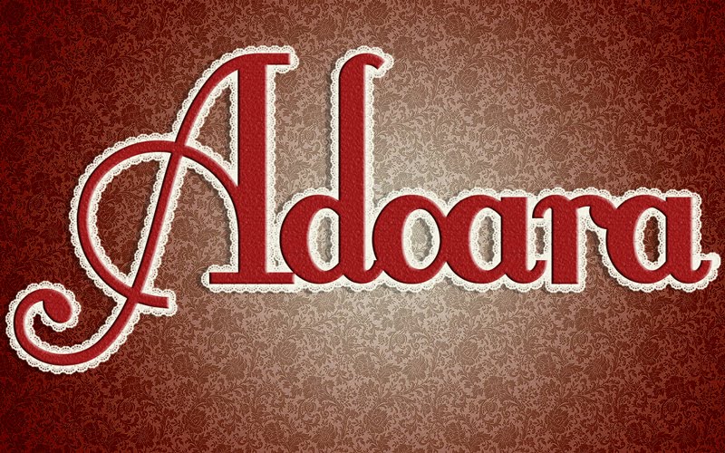
Here is my typography project. I wanted to go with an interesting and original idea here. So I used the word rock and used the music idea for this artwork. Parts of the R is a guitar when the rest is the AC/DC logo font. The O is drums. C is wired for a mic. The K is a clipping mask of tapes. I created this using photoshop.


No comments:
Post a Comment